Phones and Accessories
 Computers and Accessories
 Men Clothing & Fashion
 Women Clothing and Fashion
 Home Improvement & Tools
 Jewelry & Accessories
 Health and Beauty
 Skincare
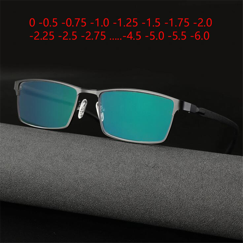 Photochromic Glasses (Lens)
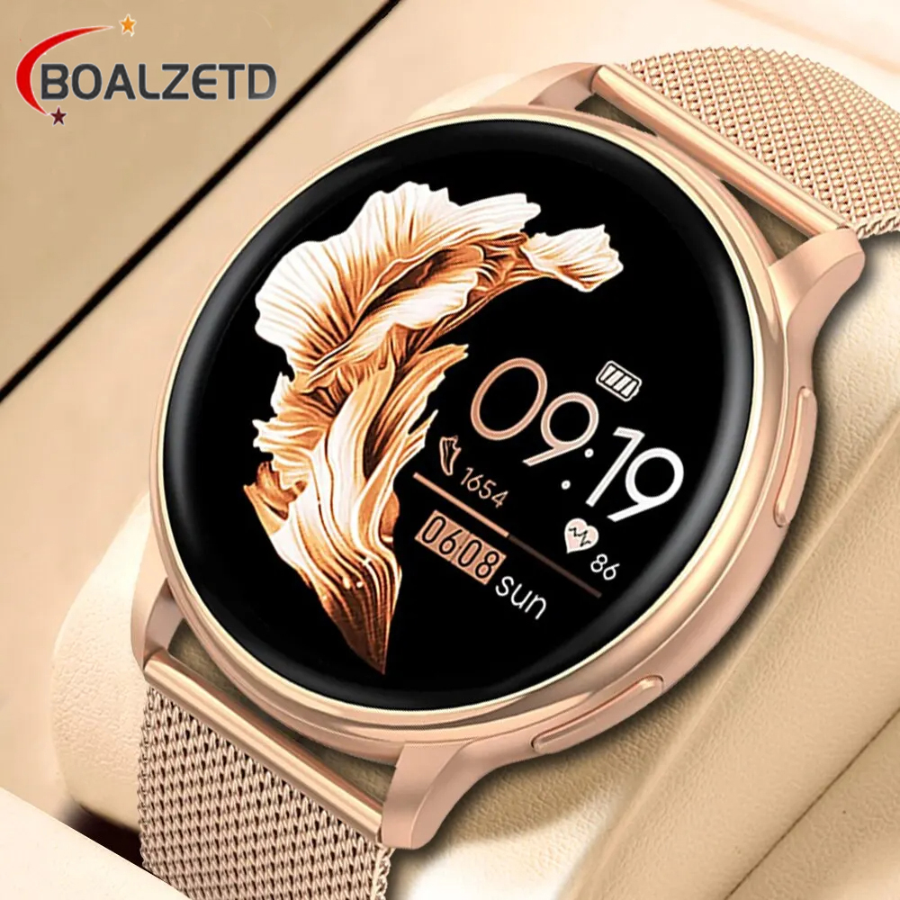 Smart watch
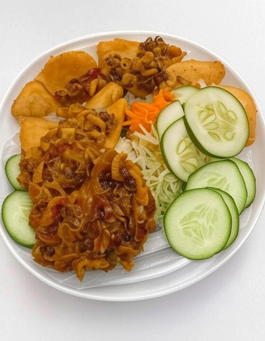 Food and Groceries
 Animals & Pet Supplies
 Apparel & Accessories
 Arts & Entertainment
 Baby & Toddler
 Business & Industrial
 Cameras & Optics
 Electronics
 Food, Beverages & Tobacco
 Furniture
 Hardware
 Health & Beauty
 Home & Garden
 Luggage & Bags
 Mature
 Media
Media Office Supplies
 Religious & Ceremonial
 Software
 Sporting Goods
 Toys & Games
 Vehicles & Parts


The Silent Sale Killer: Why Your Website Colors Are Hurting Your Customers’ Eyes and Your Profits
Table of Contents
The Pain of a Thousand Sunsets: Why Your Website’s Look is Chasing People Away The Psychology of Color in the African Market Localization: Designing for the Nigerian User Building Trust Through Visual Verification Conclusion: A Sight for Sore Eyes (and a Boost for Your Brand) The Technical Side: Contrast and Accessibility Editor’s Choice: The Hustler’s Essential The 'Sunlight' Test Key Takeaways for Your Website Overhaul:

The Pain of a Thousand Sunsets: Why Your Website’s Look is Chasing People Away
Imagine this: It is 8:30 PM in the heart of Lagos. After a long day of maneuvering through the hustle of the city, you finally get a moment of peace. You bring out your phone, ready to shop for that new pair of shoes you’ve been eyeing. You click a link, and suddenly—BAM! Your screen explodes with a neon green background and bright yellow text. Your eyes sting. You squint. Within three seconds, you’ve closed the tab. You didn't even see the prices, let alone the products.
This isn't just a minor annoyance; it’s a business tragedy. In the Nigerian e-commerce space, where competition is fierce and data is precious, your website’s color scheme is often the difference between a 'Successful Checkout' and a 'Bounce.' If your website colors are hurting people’s eyes, you aren't just losing views—you are burning money.
The Psychology of Color in the African Market
Color is more than just aesthetics; it is communication. In Nigeria, we are surrounded by vibrant colors—the yellow of the Danfo, the green of our flag, the rich palettes of our Ankara fabrics. However, what works on a piece of cloth doesn't always work on a mobile screen. When a customer lands on your page, their brain processes the color before they even read a single word of your copy.
Trust is the currency of Nigerian e-commerce. If your website looks like a 'Yahoo-Yahoo' site from 2005 with flashing red buttons and clashing gradients, nobody will trust you with their hard-earned Naira. Professionalism is signaled by balance. Bright, aggressive colors trigger a 'danger' response in the subconscious, making users feel uneasy. On the other hand, well-balanced tones create a sense of reliability and safety.
The Technical Side: Contrast and Accessibility
Why do your eyes hurt when looking at certain sites? It’s usually a lack of proper contrast or the presence of 'vibrating' colors. For example, putting bright blue text on a red background makes the edges of the letters seem to glow or shake. This is called 'chromostereopsis,' and it’s a fast track to giving your customers a headache.
- High Contrast is King: Black text on a white or very light grey background is the gold standard for a reason. It is readable under the harsh Nigerian sun and easy on the eyes during a midnight browsing session.
- Avoid the 'Neon Trap': While you want to stand out, ultra-bright neon colors can cause 'eye fatigue.' If a user’s eyes get tired, they leave your site to find relief elsewhere.
- The 60-30-10 Rule: Use a dominant color for 60% of the site (usually a neutral white or light grey), a secondary color for 30%, and an accent color (like a bold brand color) for the final 10%.
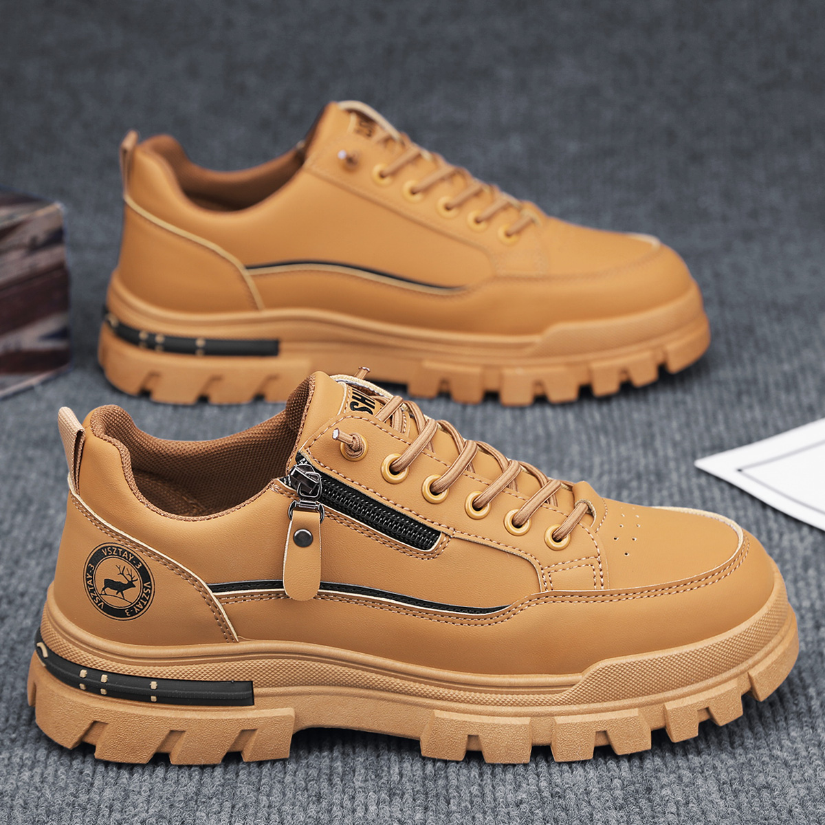
Editor’s Choice: The Hustler’s Essential
While you’re fixing those website colors to keep your customers comfortable, don't forget to keep yourself comfortable too. Whether you’re scouting for new logistics partners or heading to a meeting at the Kanemtrade hub, the Men's casual sports outdoor hiking trendy fashion street comfortable footwear is our top pick for the modern entrepreneur. It’s built for the Nigerian terrain—durable, stylish, and perfect for the grind.
Reliable. Trendy. Built for the Street.Localization: Designing for the Nigerian User
In Nigeria, we face unique challenges that affect how we view websites. Many of your customers are using mid-range smartphones with screens that aren't perfectly calibrated. If your website colors are too subtle, they might wash out completely in daylight. If they are too dark, they become a mirror for the user's face rather than a storefront.
Furthermore, we must talk about Logistics and Trust. Nigerians are naturally skeptical of online shopping due to the history of 'What I ordered vs. What I got.' A clean, professionally colored website acts as a 'Verification' of its own. It says, 'We are a real business.' This is why platforms like Kanemtrade are so vital. By integrating your business with a trusted ecosystem that understands the local landscape, and combining it with a visually soothing website, you bridge the gap between skepticism and a sale.
The 'Sunlight' Test
Have you ever tried to use your own website while standing outside in the afternoon sun in Abuja or Kano? If you can’t read your 'Buy Now' button because the color is too faint or the contrast is too low, you are losing every customer who tries to shop while on the move. Your website needs to be 'Street-Ready.' This means high-contrast buttons, clear typography, and a layout that doesn't require the user to strain their eyes to find the price tag.
Building Trust Through Visual Verification
Beyond just the colors of your buttons, the colors of your 'Trust Badges' matter. In Nigeria, seeing the green and white of a verified local payment gateway or the logo of a reputable logistics partner provides instant relief to the customer. When these elements are placed on a clean, professional background, they pop. When they are buried in a chaotic, rainbow-colored mess, they lose their power.
Using Kanemtrade for your e-commerce needs allows you to tap into a system where trust is already built-in. But you must do your part. Ensure that your storefront reflects that same level of quality. Your website is your digital office; don't paint the walls with colors that make people want to run out the door.
Key Takeaways for Your Website Overhaul:
- Stick to Neutrals: Use whites, greys, and soft blues to create a calm environment.
- One Call to Action: Your 'Add to Cart' button should be the only thing that uses a high-energy color like orange or green.
- Test on Mobile: Always check your site on a mobile phone at different brightness levels.
- Think Locally: Ensure your design reflects the reliability that Nigerian shoppers crave.
Conclusion: A Sight for Sore Eyes (and a Boost for Your Brand)
At the end of the day, e-commerce is about reducing friction. Every time a customer has to squint, zoom in, or rub their eyes because of your website’s design, you are adding friction. You are giving them a reason to click 'Back' and go to a competitor. By choosing a palette that is accessible, professional, and optimized for the unique Nigerian environment, you aren't just making a 'pretty' website—you are building a high-converting sales machine.
Stop hurting your customers' eyes. Start showing them that you are a verified, professional brand they can trust. When your visual presentation meets the quality of the products you sell, the sales will naturally follow. Remember, in the world of online business, clarity is luxury, and luxury sells.